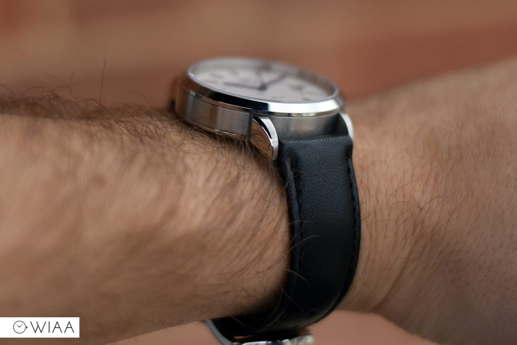
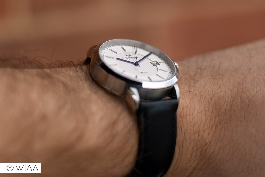
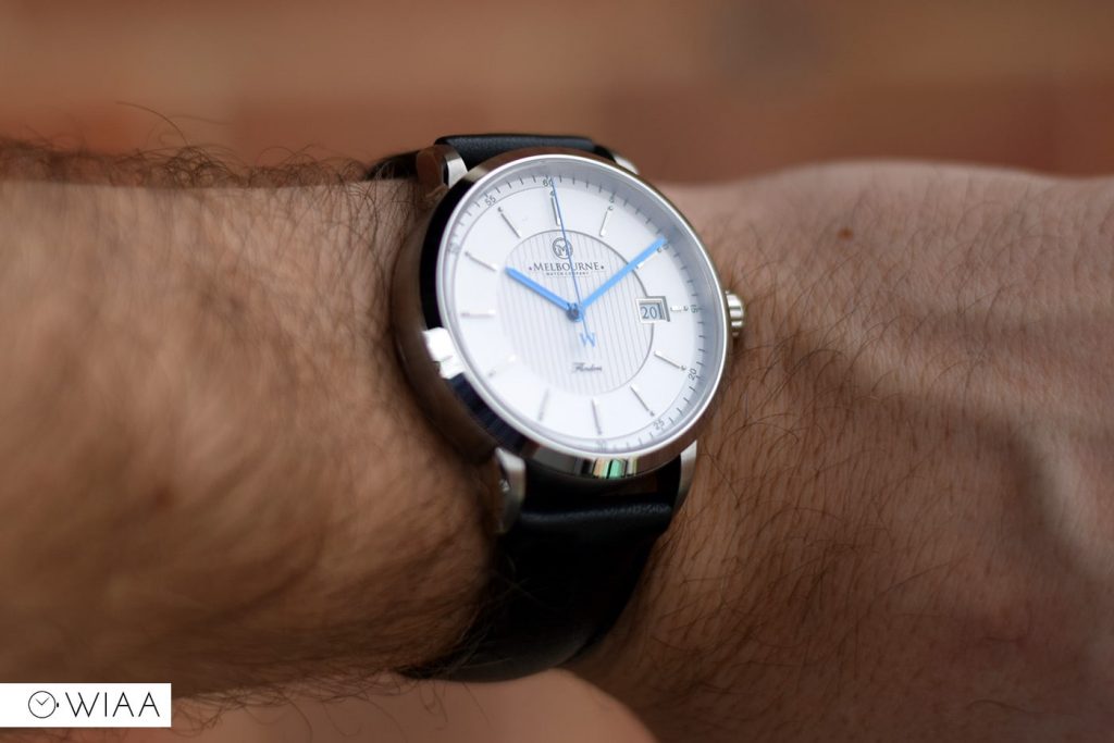
I was one of the first to review Melbourne Watch Co’s first release, the original Flinders over 4 years ago. Now, they’ve re-released that model as the “Flinders Classic”; hand assembled by their in-house technical team in their Melbourne, Australia workshop.
Comparing the two, it’s obvious that Melbourne Watch Co have come a long way. To think around 5 years ago Sujain started off building custom pilot, PAM, and marine watches under the guile of “Melbourne Custom Watches”.
To me, they were one of the first true microbrands that we see so much of nowadays – using Kickstarter to springboard their dreams of becoming a successful brand. Nowadays, there’s a new release on Kickstart every week. 4 years ago, however, it was all pretty new.
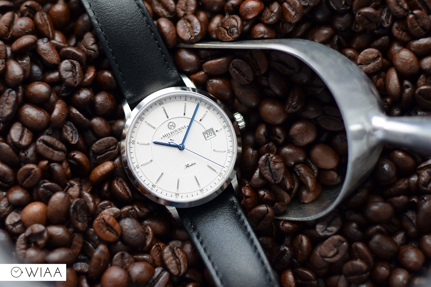
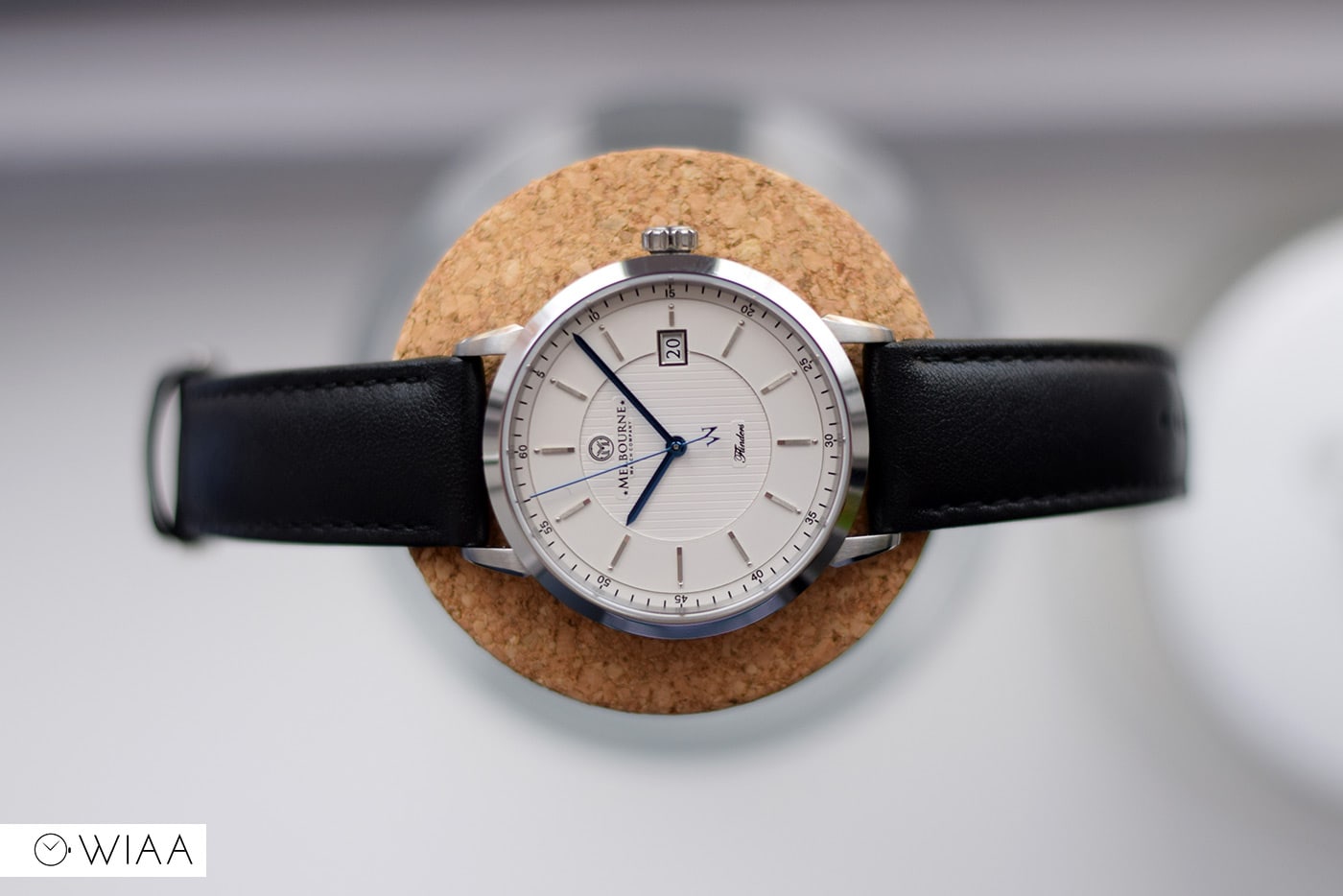
Like the original, at a glance the Flinders Classic looks plain and simple; but has a few tricks up its sleeve by way of little design nuances which I love – a sign of clever design. Let’s take a closer look to see how it fares.
Video review
The specs
- Dimensions: 40mm diameter x 9.9mm height x 47mm lug to lug
- Weight: 77g
- Water resistance rating: 5ATM / 50m
- Movement: Sellita SW200-1
- Accuracy: -0.5 sec/day
- Lug width: 20mm
- Warranty: 2 years
- Price: AUD $950 / £535 / $700
- Available from:
- DIRECT – https://www.melbournewatch.com.au/collections/flinders/products/flinders-classic
- UK based? Page & Cooper are their official rep – https://www.pageandcooper.com/melbourne-flinders-classic/
The case
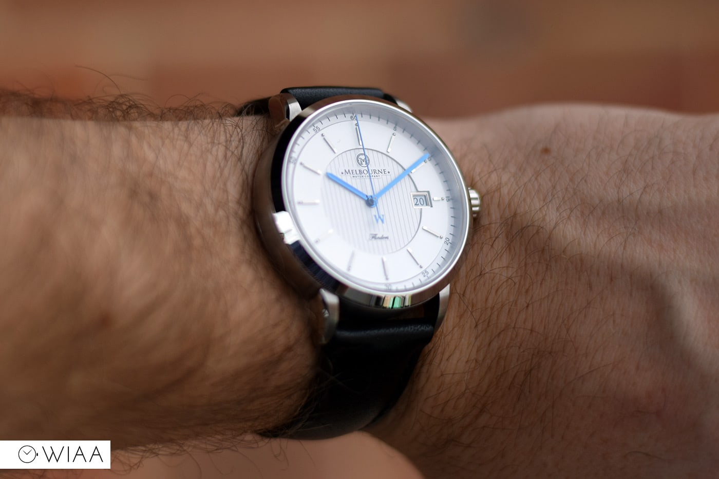
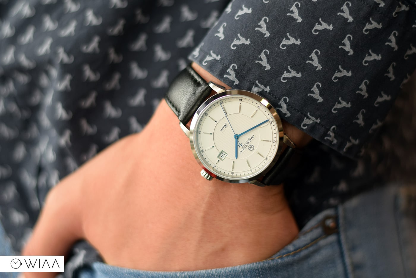
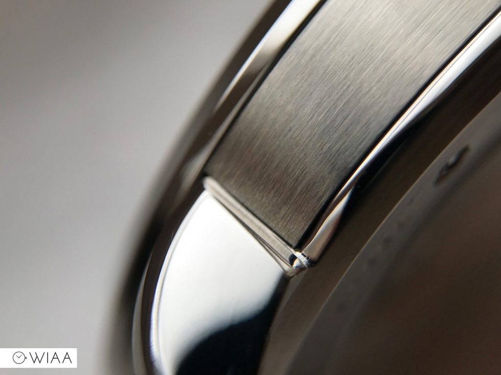
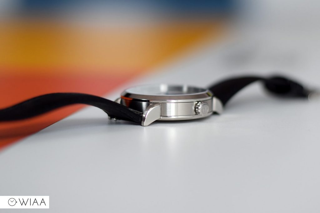
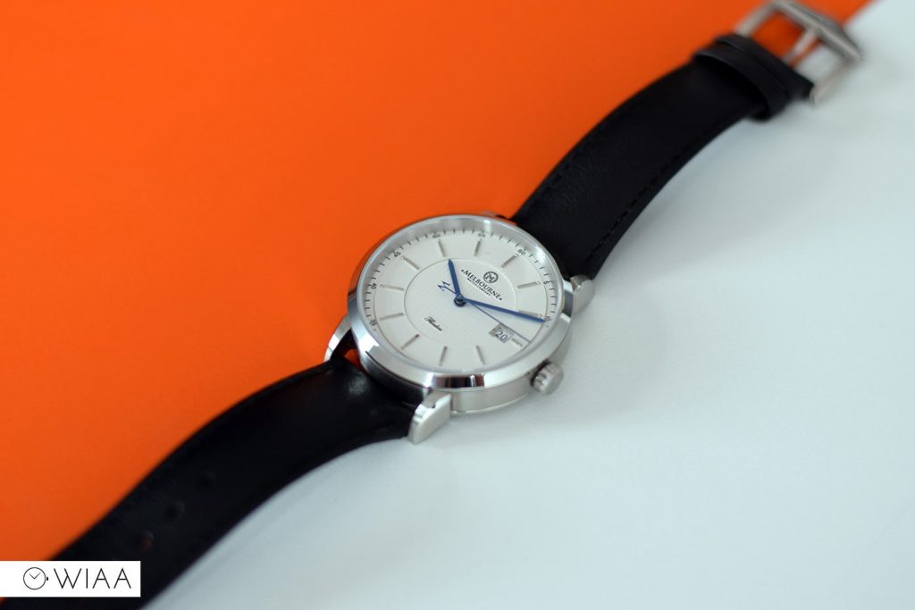
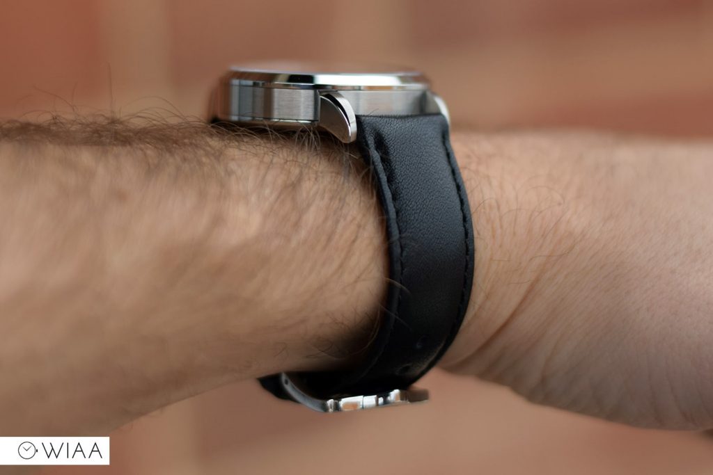
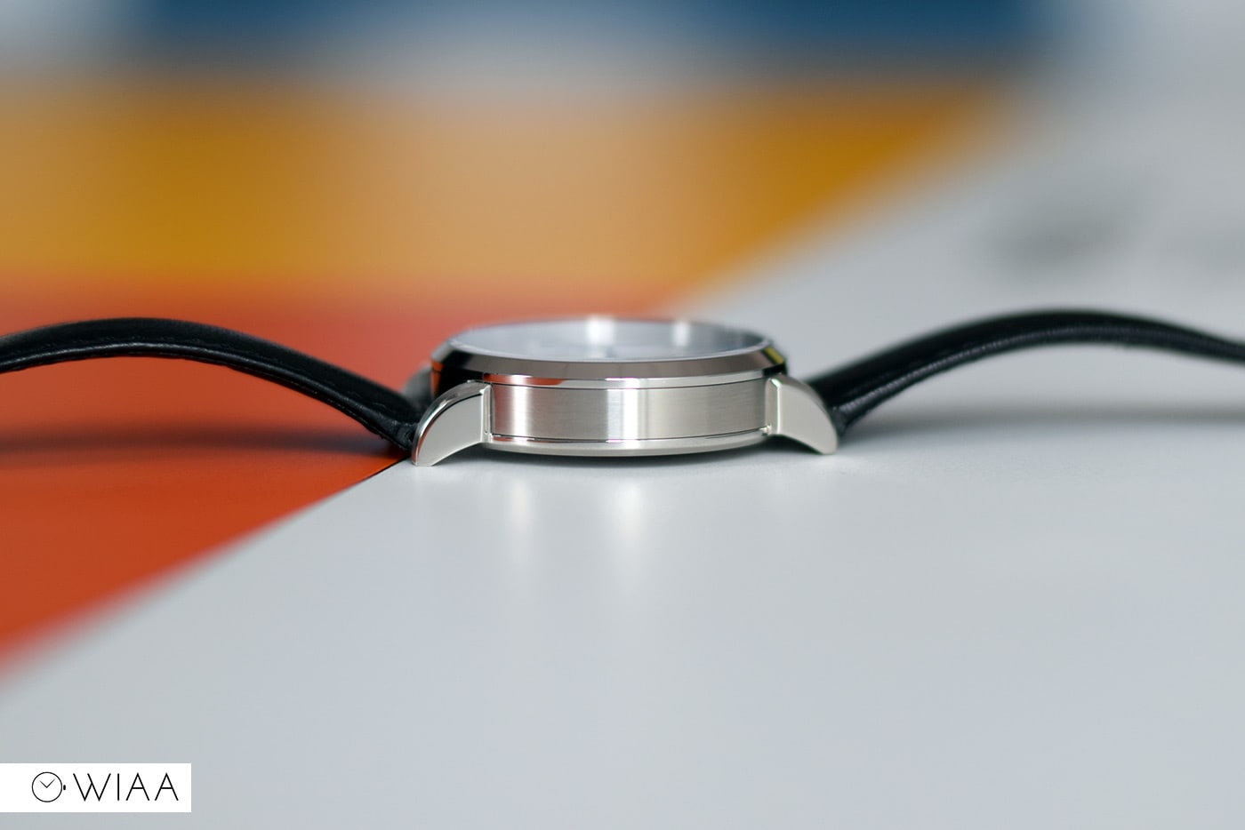
The case actually wears quite large for a 40mm diameter; most likely due to the fact that it’s all dial – thanks to the thin bezel, and also the shape of the barrel. It’s not the most shapely, but it has a pleasant array of finishes and angles working well together. It has a slightly unconventional construction – the caseback and lugs are together as one unit, whilst the barrel fits around the lugs and then the bezel sits on top.


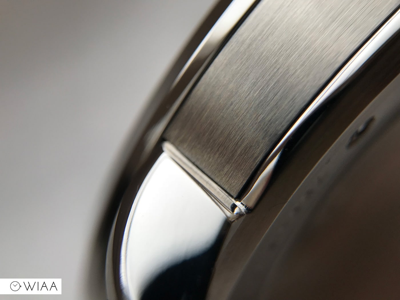
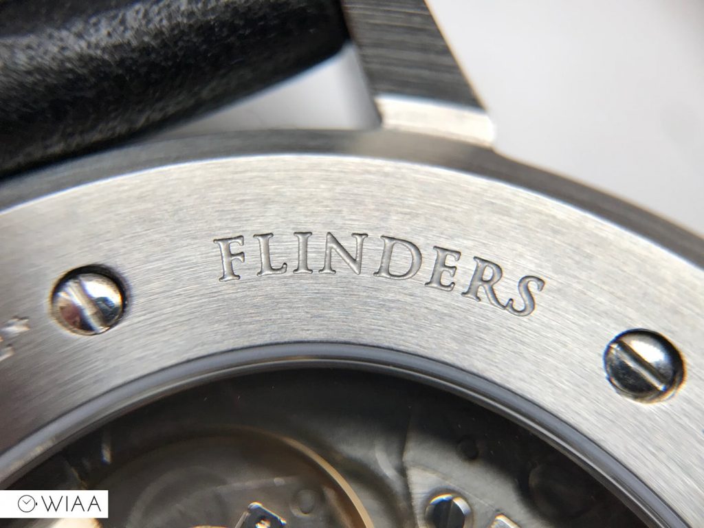
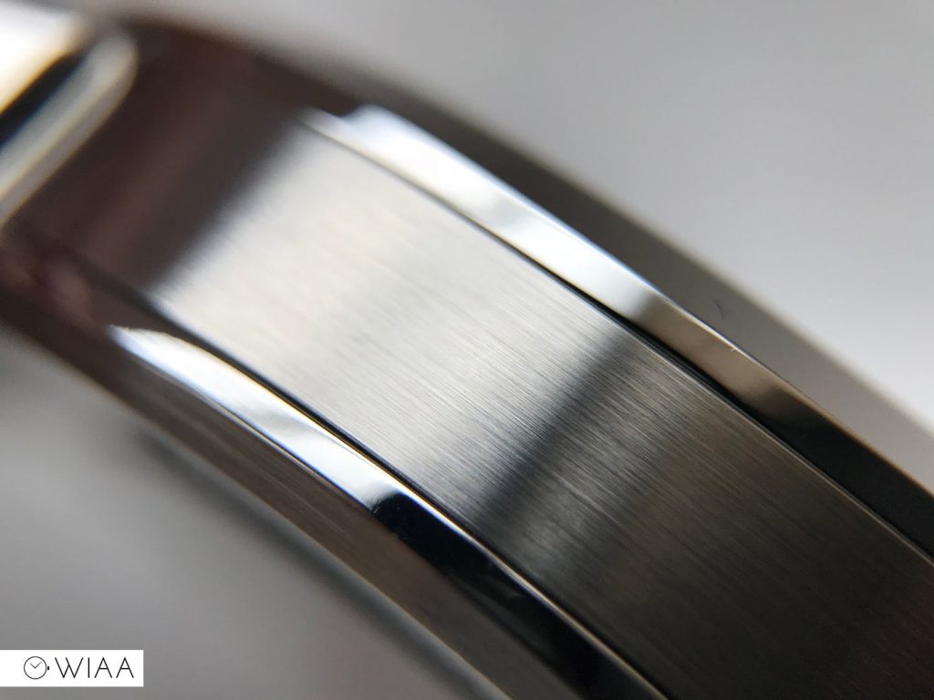
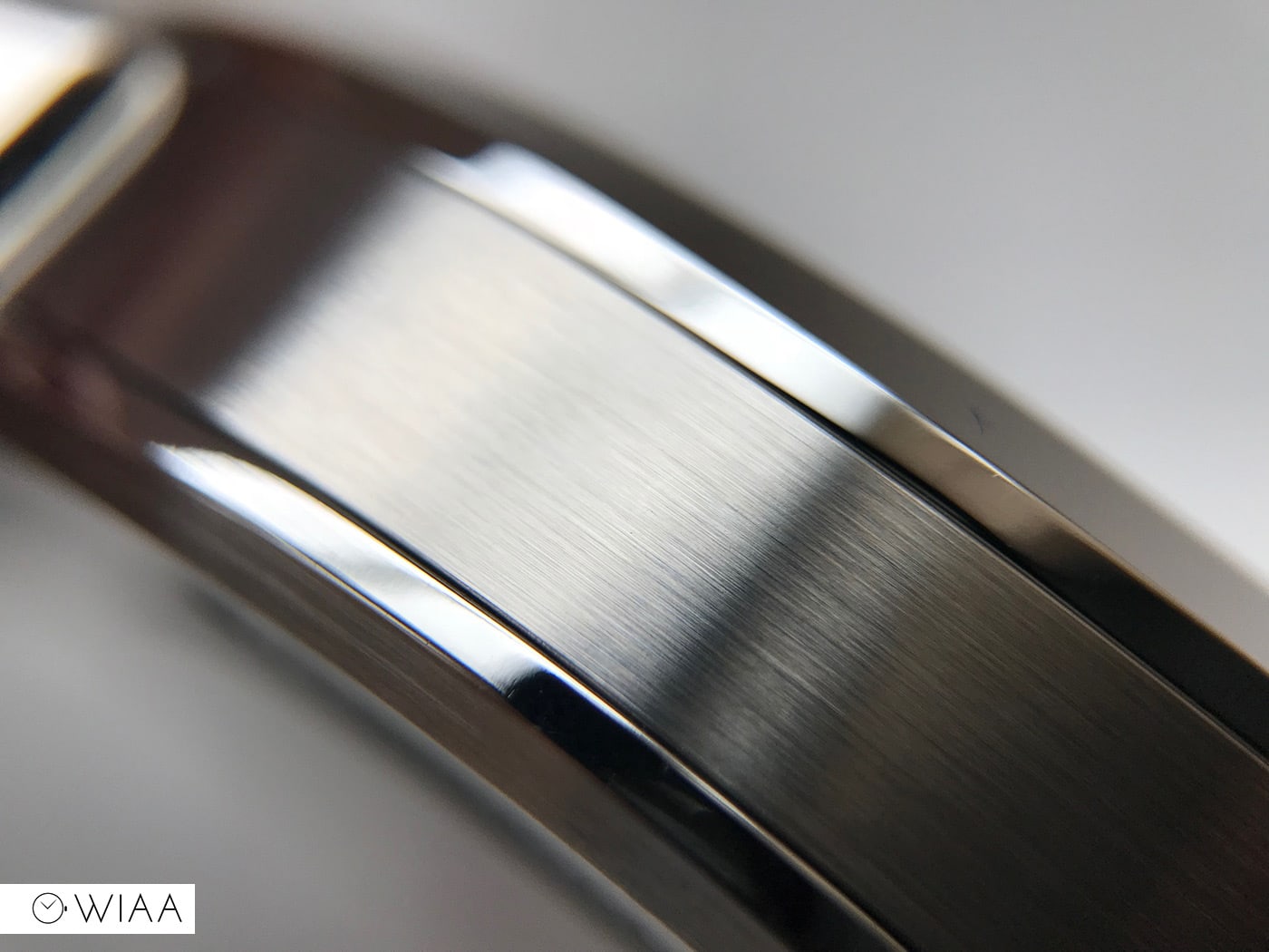
The fully polished bezel has a precise angle and joins to the case, which in turn is fully brushed. The lugs are polished on the sides and shoulders, whilst the top and insides are brushed. The caseback has a thin polished edge which is visible whilst wearing the watch, with the flat back being brushed housing various details deeply engraved surrounding the exhibition window.
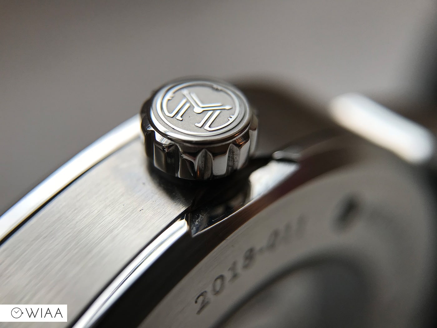
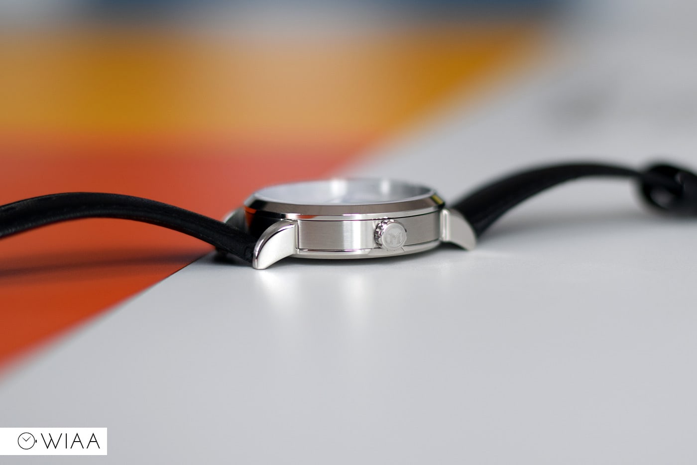
The push-pull crown is very easy to use thanks to a tiny nick in the underside of the case, allowing you to get your nail in easily underneath it to pull it out – a great idea that should be out there more. The crown itself has the M logo embossed on the end, which is polished against a blasted backdrop. The grip is thick yet classy, and easy to use. I always used to think that the crown on the original Flinders stuck out too much, so I’m pleased to see the dimensions have been revised.
The flat sapphire crystal is exceedingly clear, with a very effective anti-reflective coating.

The dial
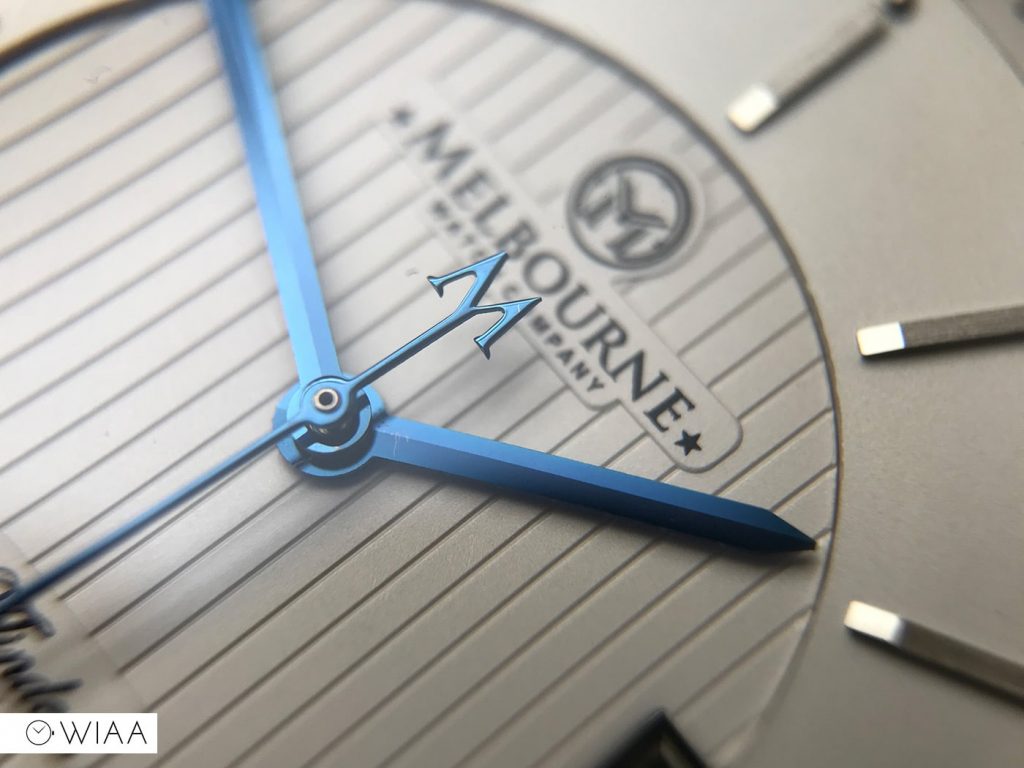
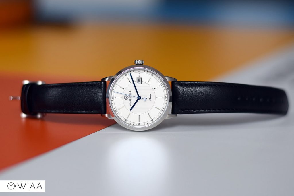
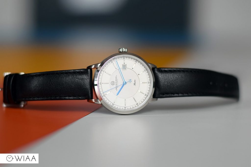
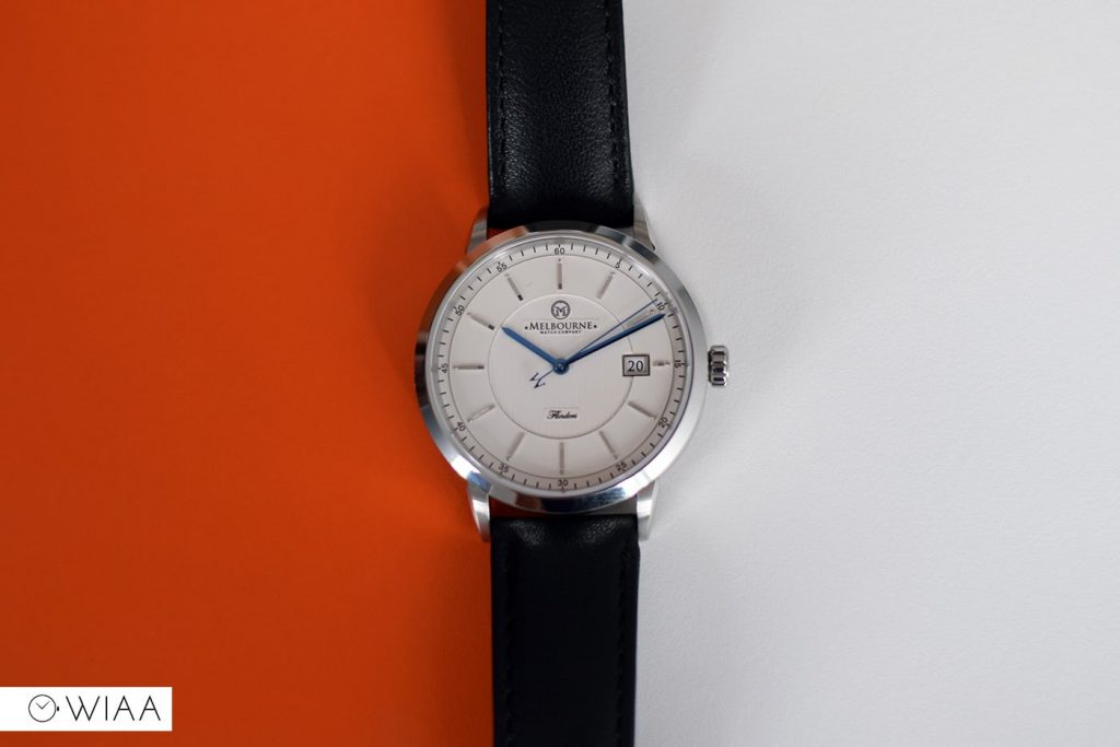
The Flinders Classic has a crisp, multilayered, bold, white dial. There’s a central disc with vertical channels surrounded by an outer edge at a higher level, providing a sense of depth to the dial. The very outside minute track drops down to the same level as the centre.
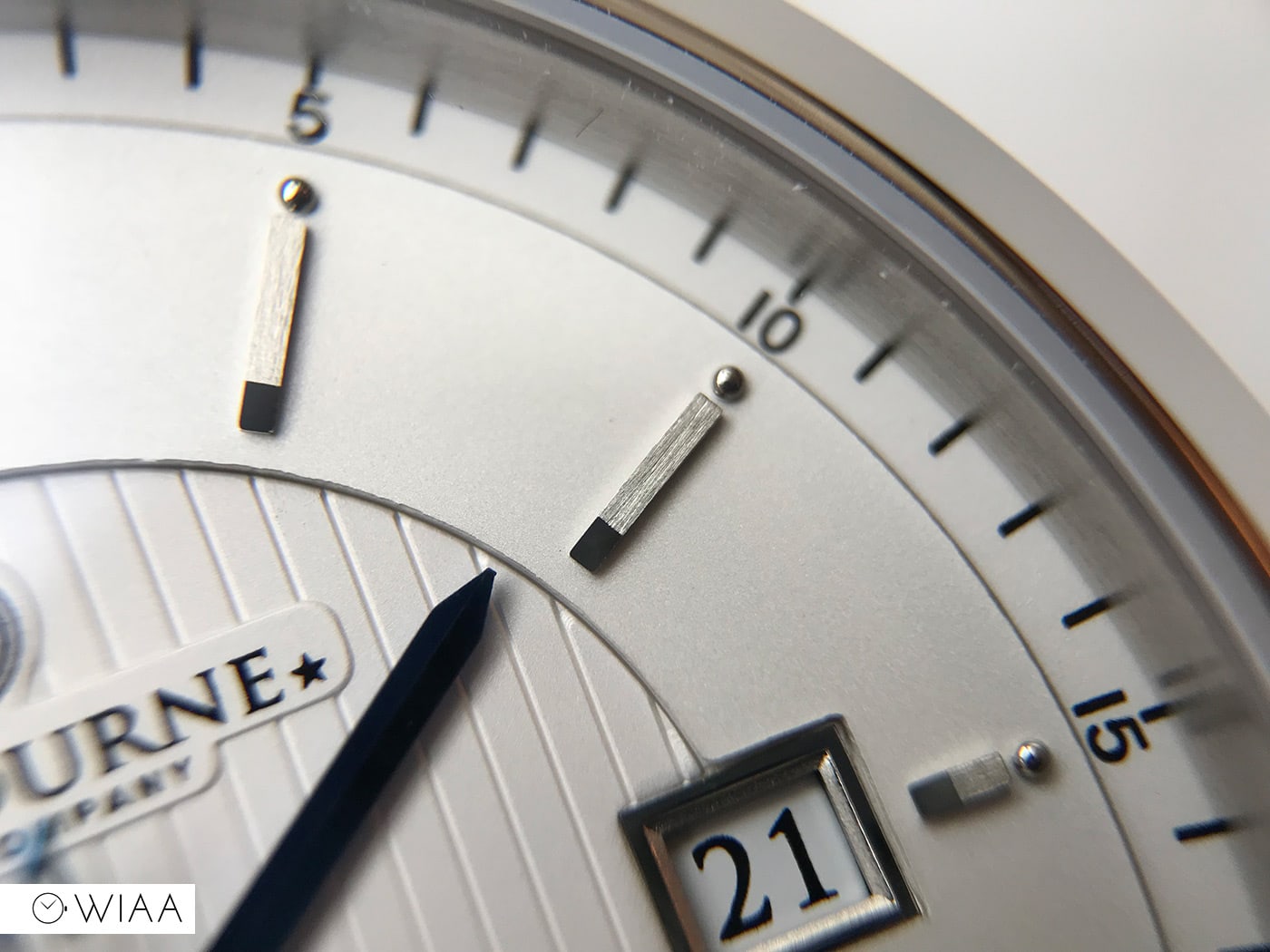
The printwork is all delicate and crisp, the thin black ink on the white dial is very elegant.

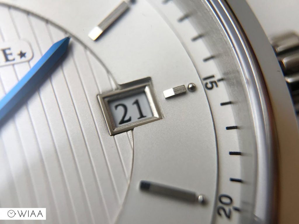
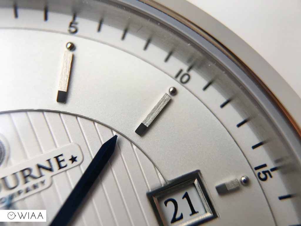
The applied indices are intricate and are spotlessly manufactured, with square edges and a ramped end; as well as a subtle separate sphere at the base which tops it off. The design is the same as original, but higher craftsmanship.
The date wheel has a polished steel border, cutting into the higher outer ring. There’s a custom font used on the white date wheel.
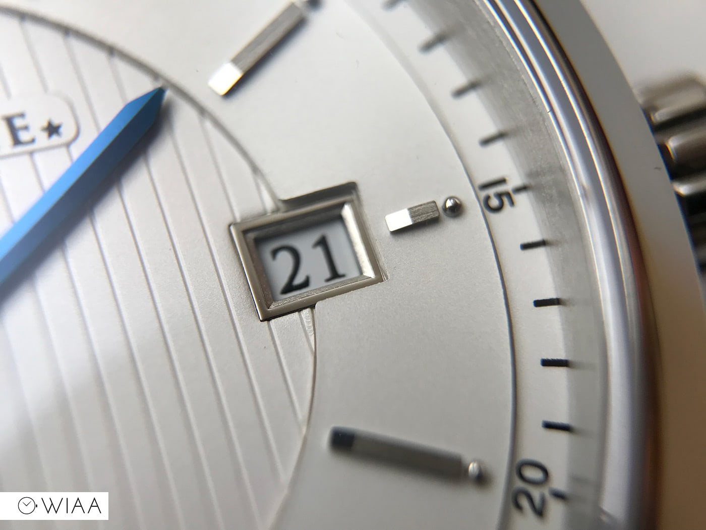
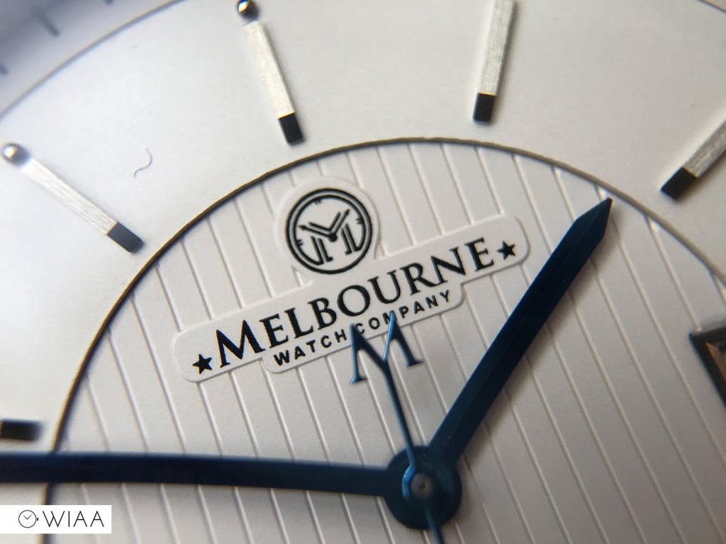
The main hands are simple in shape; straight with a pointed tip. They’re blued and pitched which catch the light so well. The seconds hand is the same across every single Melbourne Watch – a thin point with the “M” of the logo as a counterweight.

Unfortunately there’s a stray bit of fluff on the dial at around the 52-minute mark; hopefully, this is due to the watch being a press loaner.
The strap
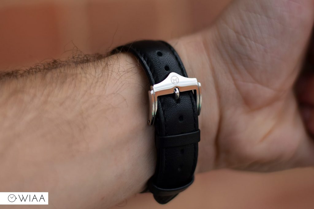
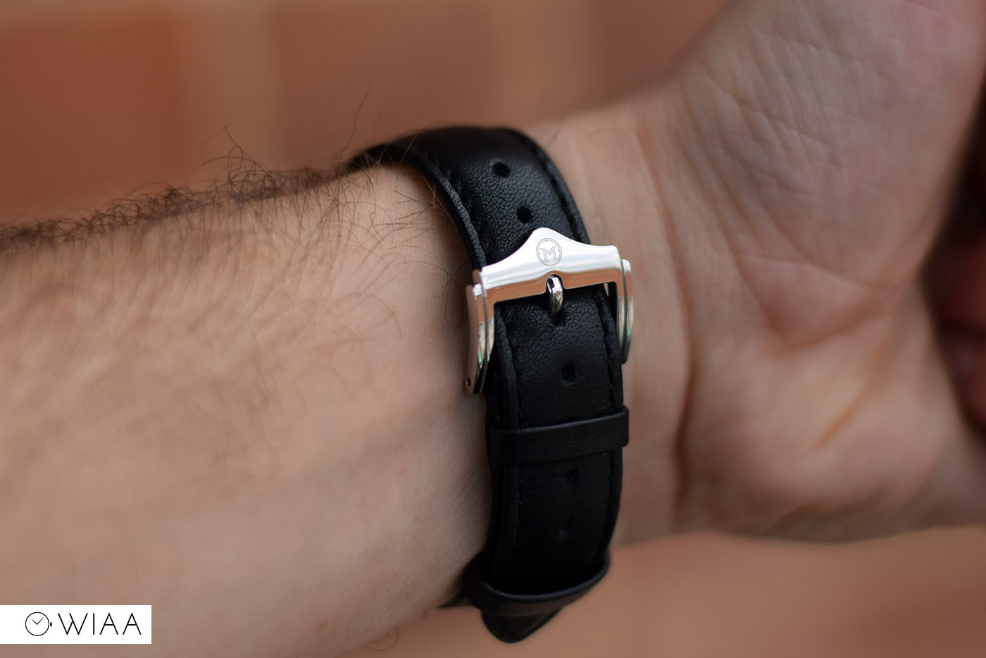
For me, 20mm wide is a suitable size for the strap. The soft, matte textured top grain is clearly very good quality leather, which is backed up by the lovely smell. The matching black stitching keeps things classy.
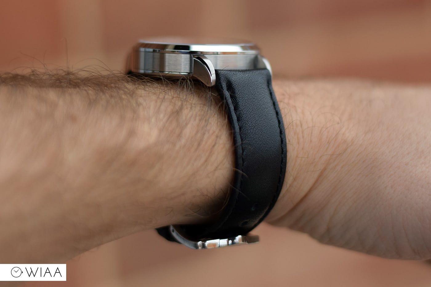
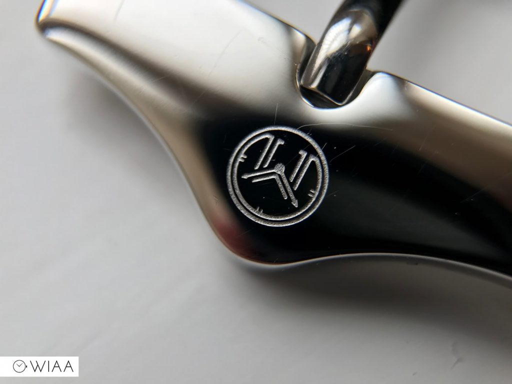
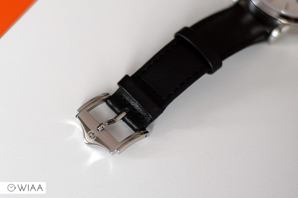
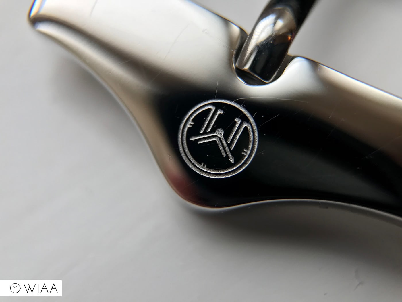
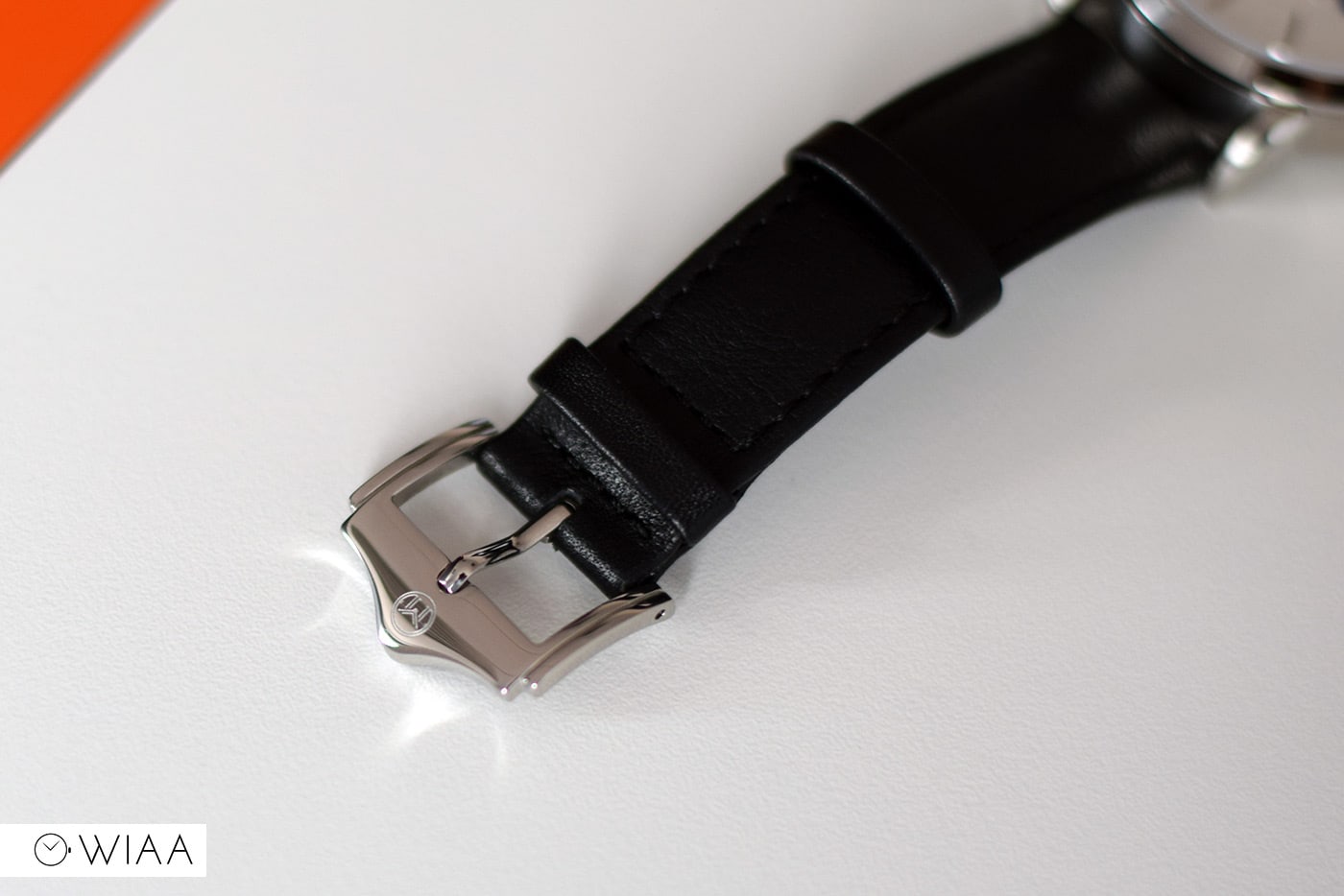
The fully polished buckle is the same style from the very beginning – a bulbous top bar which houses the Melbourne Watch Co logo. It’s good to see a twist like this on the buckle, as they can be so boring and plain. Down either side is a channel that catches the eye. Just be careful, as the polished nature is sure to pick up plenty of hairline scratches pretty quickly.
The movement
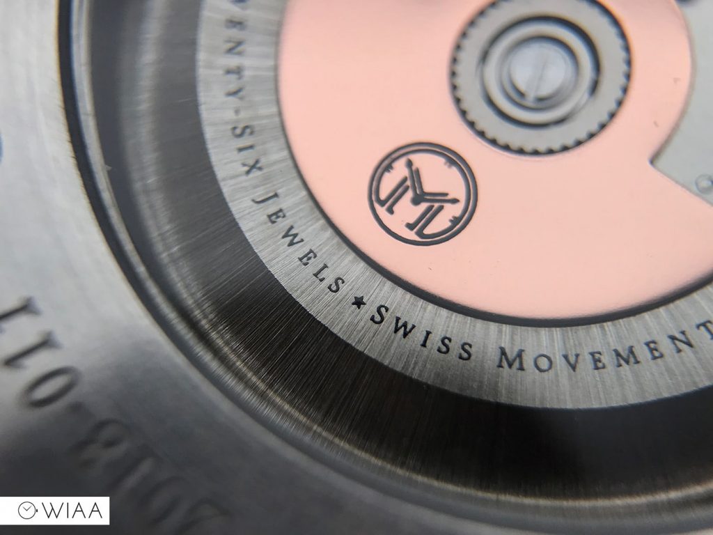
The movement is a fine upgrade from the Miyota 9015; the Swiss Made Sellita SW200-1. It is visually exactly the same as the ETA 2824-2, bar the inclusion of an extra jewel. It has an excellent reputation, and will surely be reliable and serve you well got many years.
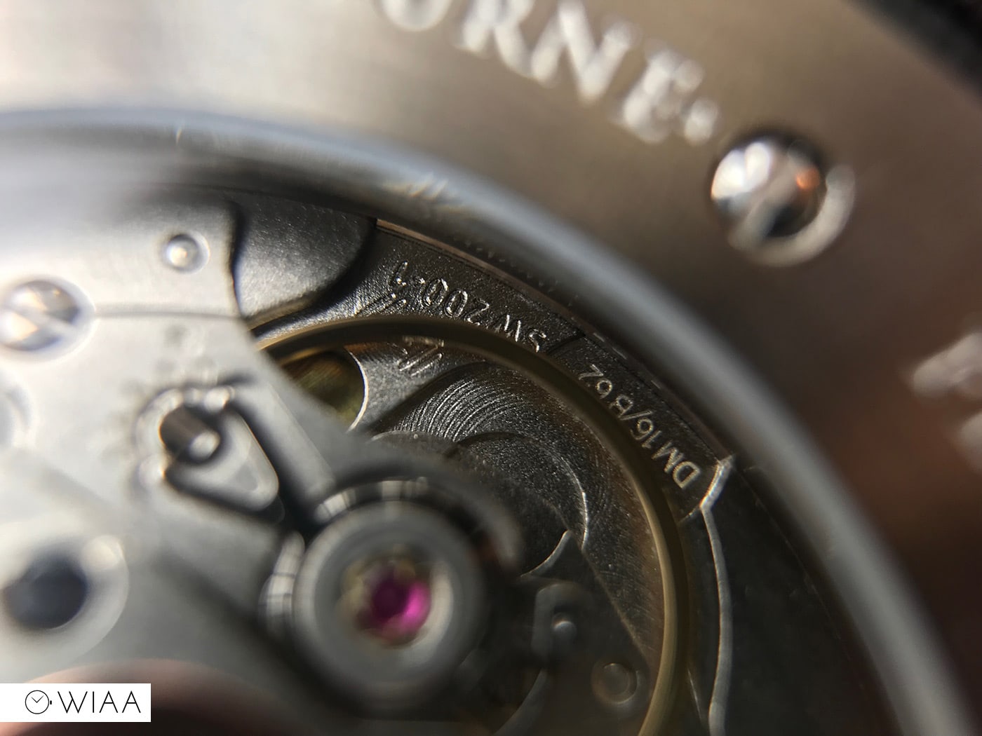
The specs are all as you’d expect: 28.8k bph (8 ticks per second), 38-hour power reserve, hacking seconds hand, hand and automatic winding.
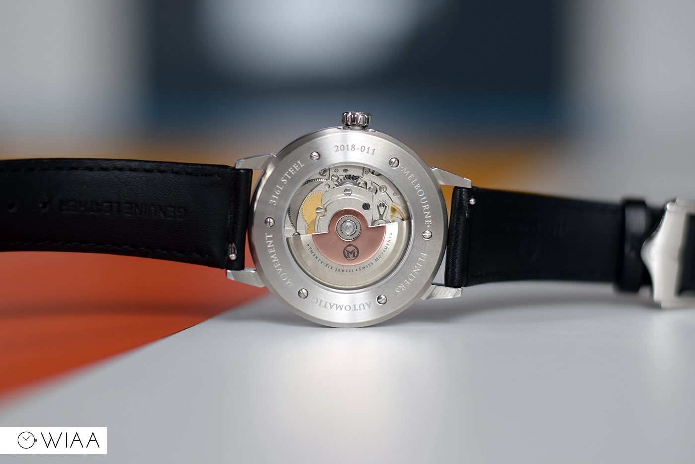
It’s clearly been excellently regulated; it’s coming in at a highly accurate -0.5 sec/day. It also has a customised rotor, with a plate applied on top and custom print work.

Final comments
Firstly, it’s worth noting that there’s no doubt that this Flinders is many times better than the original; and that also goes to show how far Melbourne Watch Co have come in just a few years.
Is it still worth the money? Yes AUD $950 / £535 / $700 is a lot, there’s no denying that. I’m sure many of you are saying that you can get fully Swiss Made equivalents for that – and you’re right, you can. However, we’re seeing an interesting shift currently thanks to Microbrands like MWC. As only 50% or so of the VALUE of a watch has to be constructed in Switzerland to allow those two ever-so-important words printed on the dial (that cost is usually covered by the movement and labour itself), the majority of some “Swiss Made” watches are actually made in China. Indeed, this demonstrates that the microbrands that are openly made in China are actually on a par with some Swiss Made watches. I’m not talking about Omega or Rolex, but the more affordable Swiss timepieces are honestly no different to a watch like this Flinders apart from those two words on the dial.
Anyway, rant over. Is it worth it? I believe so. The level of finishing is beautiful, and the movement’s regulation is top-notch. The fluff under the dial is a bummer, but I’m pretty sure it’s a one-off and wouldn’t happen again. I love to close attention to detail on the dial and case, and despite it looking simple at a glance, there are little nuances that impress.
